🤔Why do we need to use the CSS Module how to use it in React?🔮

Hi, I’m Richa — a Senior Frontend Engineer with 5+ years of experience building scalable, production-grade web interfaces for enterprise and consumer applications. I work primarily with React, TypeScript, and modern frontend architectures, focusing on component systems, performance, and maintainability. Most of my experience comes from building real-world products in regulated domains like banking and insurance, where clarity, reliability, and long-term ownership matter more than quick demos. Through this blog, I write about frontend engineering fundamentals, scalable UI design, problem-solving, and the lessons I’ve learned working on large codebases. My goal is to share practical insights — not shortcuts — for developers who want to grow strong engineering foundations. I also mentor early-career developers and strongly believe that curiosity, asking the right questions, and understanding why something works are more important than memorizing tools. If you’re serious about improving as an engineer, you’re in the right place.
🎯 Introduction
Hello, Developers!! 👩💻👩💻 In this blog we are going to learn about CSS Module. Why do we need to use the CSS Module How to use it in React? It's a good question if you asked we have CSS then why do we need this one let's understand this in this way.

CSS Modules allow you to use the same CSS class name in different files without worrying about naming clashes.
What is a CSS module?🤷♀️
CSS module is a CSS file in which all class names and animation names are scoped locally by default
In short, all the CSS declared in the file are local to the file in which this CSS file is imported.
We will use CSS modules in the context of React but they are not limited to just React.
You can use the CSS modules with any module bundler like webpack or browserify or any other way which supports importing CSS files.
🎇Benefits of CSS modules:-

Using CSS modules avoids namespace collision for CSS classes
You can use the same CSS class in multiple CSS files
You can confidently update any CSS file without worrying about affecting other pages
Using CSS Modules generates random CSS classes when displayed in the browser
🕶Why do we need to use the CSS Module?

In the React application, we usually create a single
.cssfile and import it to the main file so the CSS will be applied to all the components.But using CSS modules helps to create separate CSS files for each component and is local to that particular file and avoids class name collision.
That's enough about the Introduction. Let's see how to use it in Code.

🎊Using CSS Modules
CSS modules support is provided by create-react-app out-of-the-box so we don't need to install or configure anything to get it working.
When working with React, it's a convention to name the CSS file with .module.css extension.
Suppose, we have a button.module.css file in the src folder with the following content:
import React from "react";
const Button = () => {
  return (
     <div>
        <h1 className={buttonStyles.title}>CSS Modules</h1>
      </div>
  );
};

export default Button;
then in the src/Button.js file, we import this file in the following way:
import buttonStyles from "./button.module.css";
button.module.css
.title {
    font-size: 3rem;
    color: aliceblue;
    font-weight: 700;
    text-align: center;
}
Check out the above output
If you do the inspect , you will see that even though we have given as title as the class for h1, the final CSS class is different when displayed in the browser.
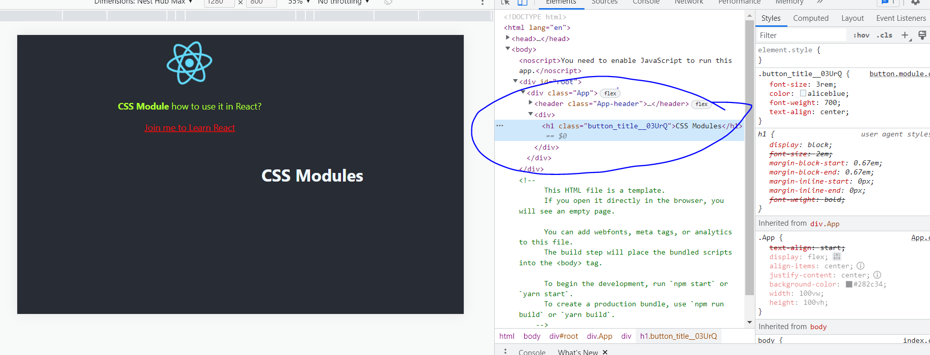
So CSS Modules help to create random classes when displayed in the browser.
🎡Using hyphens while naming classes

It's common to name a CSS class with hyphen like button-containers.
So to use that class inside components we need to use the bracket notation like this:
import React from "react";
import buttonStyles from "./button.module.css";

const Button = () => {
  return (
    <>
      <div>
        <h1 className={buttonStyles.title}>CSS Modules</h1>
      </div>
/ see here {buttonStyles["button-containers"]}
      <div className={buttonStyles["button-containers"]}>
        <button className={buttonStyles["btn-one"]}>🎇</button>
        <button className={buttonStyles["btn-two"]}>🎆</button>
        <button className={buttonStyles["btn-three"]}>✨</button>
        <button className={buttonStyles["btn-four"]}>🎉</button>
        <button className={buttonStyles["btn-five"]}>🎊</button>
      </div>
    </>
  );
};

export default Button;
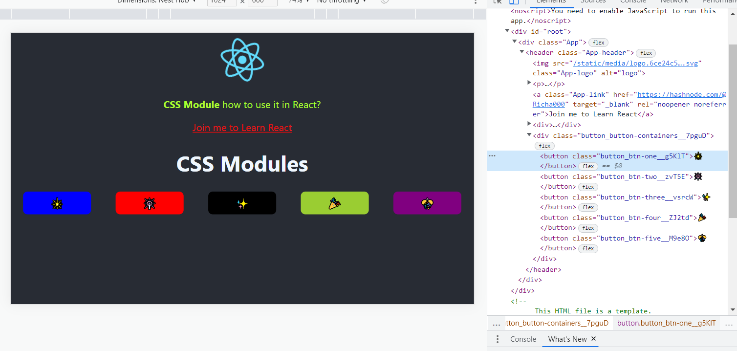
let's see the output
If you want the completed code I will provide you here you can use that
App.js
import logo from "./logo.svg";
import "./App.css";
import Button from "./Button";

function App() {
  return (
    <div className="App">
      <header className="App-header">
        <img src={logo} className="App-logo" alt="logo" />
        <p>
          <b>CSS Module</b> how to use it in React?
        </p>
        <a
          className="App-link"
          href="https://hashnode.com/@Richa000"
          target="_blank"
          rel="noopener noreferrer"
        >
          Join me to Learn React
        </a>
        <Button />
      </header>
    </div>
  );
}

export default App;
App.css
.App {
  text-align:start;
  display: flex;
  align-items: center;
  justify-content: center;
  background-color: #282c34;
  width: 100vw;
  height: 100vh;
}

.App-logo {
  height: 20vmin;
  pointer-events: none;
}

@media (prefers-reduced-motion: no-preference) {
  .App-logo {
    animation: App-logo-spin infinite 20s linear;
  }
}

.App-header {
  display: flex;
  height: 100%;
  flex-direction: column;
  align-items:center;
  justify-content:flex-start;
  font-size: calc(10px + 2vmin);
  color: greenyellow;
  cursor: pointer;
}

.App-link {
  color: #f00b0b;
}

@keyframes App-logo-spin {
  from {
    transform: rotate(0deg);
  }
  to {
    transform: rotate(360deg);
  }
}
Button.js
import React from "react";
import buttonStyles from "./button.module.css";

const Button = () => {
  return (
    <>
      <div>
        <h1 className={buttonStyles.title}>CSS Modules</h1>
      </div>
      <div className={buttonStyles["button-containers"]}>
        <button className={buttonStyles["btn-one"]}>🎇</button>
        <button className={buttonStyles["btn-two"]}>🎆</button>
        <button className={buttonStyles["btn-three"]}>✨</button>
        <button className={buttonStyles["btn-four"]}>🎉</button>
        <button className={buttonStyles["btn-five"]}>🎊</button>
      </div>
    </>
  );
};

export default Button;
button.module.css
.title {
    font-size: 3rem;
    color: aliceblue;
    font-weight: 700;
    text-align: center;
}
.button-containers{
    width: 100vw;
    display: flex;
    flex-direction: row;
    align-items: center;
    justify-content: space-around;
}
button{
    width:150px;
    height: 50px;
    padding: 10px;
    display: flex;
    align-items: center;
    justify-content: center;
    font-size: 1.5rem;
    outline: none;
    border: none;
    border-radius: 10px;
    cursor: pointer;
}
.btn-one{
    background-color: blue;
}
.btn-two{
    background-color: red;
}
.btn-three{
    background-color: black;

}
.btn-four{
        background-color: yellowgreen;
}
.btn-five{
            background-color:purple;
}
Fine Output you can see below:-

Adding multiple classes
consider we have two classes Then to use both of these classes for the same element we need to use the ES6 template literal syntax like this:
<div className={`${buttonStyles["btn-bold"]} ${buttonStyles["btn-active"]}`}>Some text...</div>
🏆Conclusion

CSS modules help to avoid global class name collisions
They also help in keeping CSS files clean and easy to organize and maintain
They are similar to styled components for maintaining local scope
They're scoped locally to avoid unintentional side effects elsewhere
They are used as the preferred styling mechanism in Gatsby.js and Next.js and they work out-of-the-box
🎯 Wrap Up!!

Thank you for reading, I hope you enjoyed it🤩Please share it with your network. Don't forget to subscribe to get my weekly newsletter with amazing tips, tricks, and articles directly in your inbox