


🐱🏍Introduction
Hello Coders👩💻👨💻 As web developers, we've all encountered the frustration of aligning modals precisely where we want them, especially relative to their parent elements. It's a common pain point that can disrupt the user experience if not handled properly. However, fear not! With the dynamic capabilities of React.js and the simplicity of hooks, conquering this challenge becomes not only feasible but surprisingly elegant.

In this blog post, we embark on a journey to demystify the process of positioning modals with precision, all within the context of React.js. By harnessing the power of hooks like useState and useEffect,useRef , we'll unveil a streamlined approach to effortlessly nestling modals exactly where they belong—right alongside their parent elements.
So, if you've ever found yourself scratching your head over modal positioning quirks, you're in the right place. Together, we'll equip you with the knowledge and techniques needed to tackle this issue head-on, empowering you to enhance your React applications with polished, seamlessly integrated modals.
Prerequisites:
Before we dive in, make sure you have a basic understanding of React.js and its hooks, particularly the useState , useEffect and useRef hooks.
Sure, let's break down the code step by step:
Import React Hooks and Stylesheet:
 import { useEffect, useRef, useState } from "react";
 import "./App.css";
This line imports necessary hooks from React (
useEffect,useRef,useState) and a stylesheet (App.css).
Define the App Component:
const App = () => {- Defines a functional component named
App.
- Defines a functional component named
Declare State Variables:
const [selectedMenu, setSelectedMenu] = useState(""); const [menus, setMenus] = useState(false);- Defines two state variables:
selectedMenuto keep track of the currently selected menu item, andmenusto control the visibility of the modal menu.
- Defines two state variables:
Create a Ref for Parent Element:
const parentRef = useRef(null);- Creates a ref (
parentRef) to reference the parent element of the modal.
- Creates a ref (
Define Sample Data:
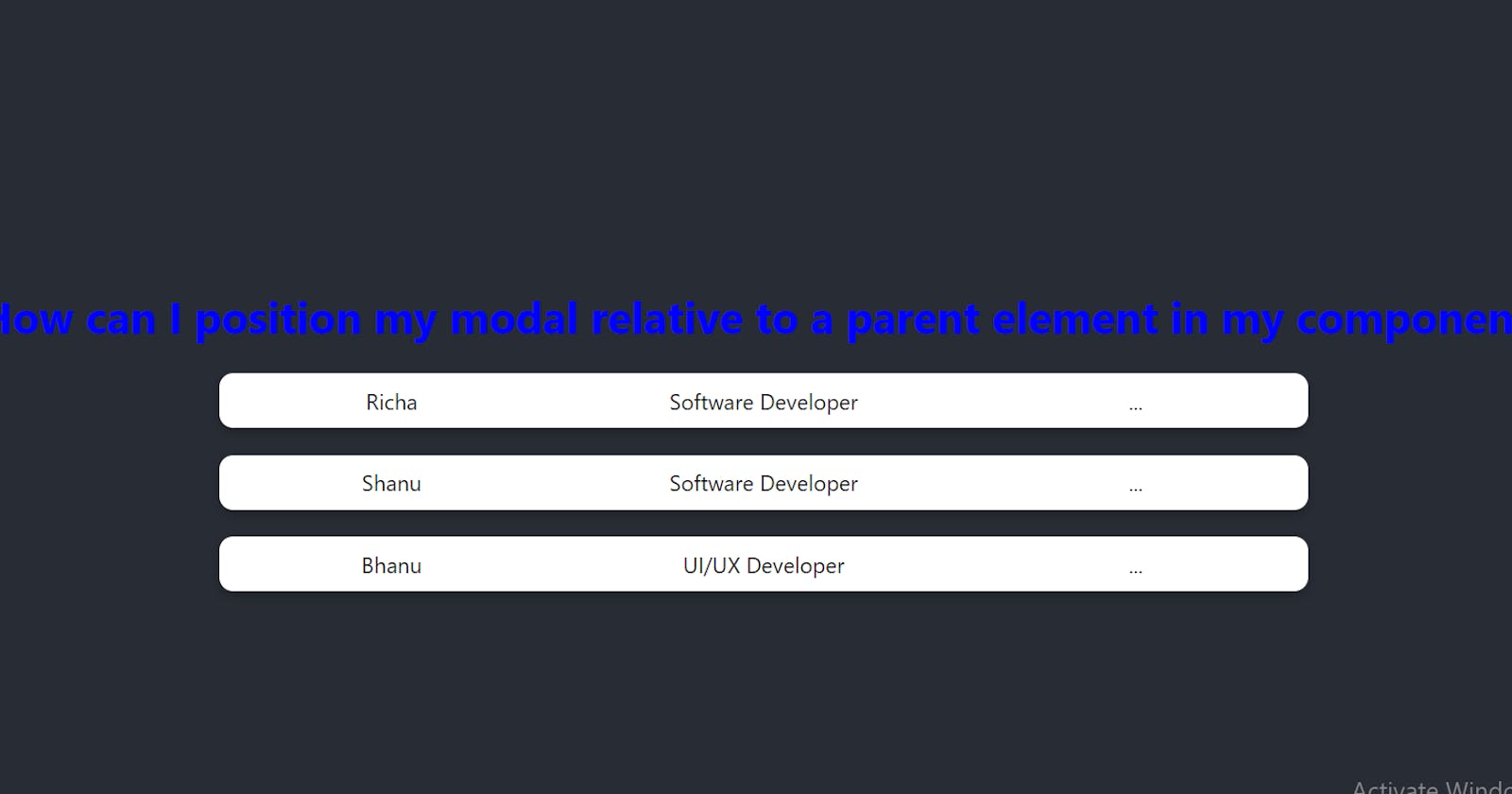
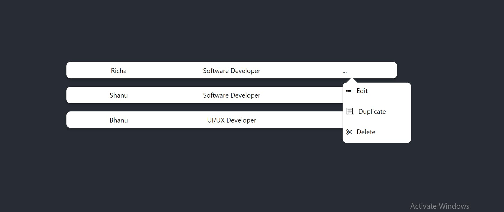
const data = [ { name: "Richa", role: "Software Developer" }, { name: "Shanu", role: "Software Developer" }, { name: "Bhanu", role: "UI/UX Developer" }, ];- Initializes an array (
data) with sample person data.
- Initializes an array (
Define Menu Items:
const menuItems = [ { icon: "✏", text: "Edit" }, { icon: "📃", text: "Duplicate" }, { icon: "✂", text: "Delete" }, ];- Initializes an array (
menuItems) with sample menu items.
- Initializes an array (
Handle Click Event:
const handleClick = (name, selectedPerson) => { name.stopPropagation(); setSelectedMenu(selectedPerson.name); setMenus(true); };- Defines a function (
handleClick) to handle clicks on the ellipsis button. It updates the selected menu and setsmenustotrueto display the modal.
- Defines a function (
Handle Outside Click Event:
const handleOutsideClick = (event) => { if (!event.target.closest(".modal")) { setMenus(false); } };- Defines a function (
handleOutsideClick) to handle clicks outside the modal. If the click target is not within the modal, it closes the modal.
- Defines a function (
Add Event Listener on Component Mount:
useEffect(() => { document.addEventListener("mousedown", handleOutsideClick); return () => { document.removeEventListener("mousedown", handleOutsideClick); }; }, []);- Adds an event listener to handle outside clicks when the component mounts. It removes the event listener when the component unmounts to avoid memory leaks.
Render JSX:
return (
  <div className="App">
    <div className="container-main">
      {data.map((person, index) => (
        <div className="table-container" key={index}>
          <div>{person.name}</div>
          <div>{person.role}</div>
          <div className="button-container">
            <div onClick={(e) => handleClick(e, person)}>...</div>
            {menus && selectedMenu === person.name && (
              <div
                ref={parentRef}
                className="modalcontainer"
                style={{
                  position: "absolute",
                  left: "0px",
                  top: "41px",
                }}
              >
                {menuItems.map((item, index) => (
                  <div key={index} className="modalDetails">
                    <span role="img" aria-label={item.text}>
                      {item.icon}
                    </span>
                    <span className="itemText">{item.text}</span>
                  </div>
                ))}
              </div>
            )}
          </div>
        </div>
      ))}
    </div>
  </div>
);

Renders JSX content:
Iterates over the
dataarray to render a table-like structure for each person.Displays the person's name, role, and an ellipsis button.
Conditionally renders the modal container if
menusistrueand the selected menu matches the person's name.Uses inline styles to position the modal absolutely relative to its parent.
Maps through
menuItemsto render each menu item with its icon and text.
This code essentially creates a React component that displays a list of people with an ellipsis button next to each. When clicked, it opens a modal displaying options to edit, duplicate, or delete the selected person's information. The modal closes when clicking outside of it.
Certainly! Here's an improved version of the code with CSS explanations and a reference to the CodeSandbox:

import { useEffect, useRef, useState } from "react";
import "./App.css";

const App = () => {
  const [selectedMenu, setSelectedMenu] = useState("");
  const [menus, setMenus] = useState(false);
  const parentRef = useRef(null);

  const data = [
    { name: "Richa", role: "Software Developer" },
    { name: "Shanu", role: "Software Developer" },
    { name: "Bhanu", role: "UI/UX Developer" },
  ];

  const menuItems = [
    { icon: "✏", text: "Edit" },
    { icon: "📃", text: "Duplicate" },
    { icon: "✂", text: "Delete" },
  ];

  const handleClick = (name, selectedPerson) => {
    name.stopPropagation();
    setSelectedMenu(selectedPerson.name);
    setMenus(true);
  };

  const handleOutsideClick = (event) => {
    if (!event.target.closest(".modal")) {
      setMenus(false);
    }
  };

  useEffect(() => {
    document.addEventListener("mousedown", handleOutsideClick);
    return () => {
      document.removeEventListener("mousedown", handleOutsideClick);
    };
  }, []);

  return (
    <div className="App">
      <div className="container-main">
        {data.map((person, index) => (
          <div className="table-container" key={index}>
            <div>{person.name}</div>
            <div>{person.role}</div>
            <div className="button-container">
              <div onClick={(e) => handleClick(e, person)}>...</div>
              {menus && selectedMenu === person.name && (
                <div
                  ref={parentRef}
                  className="modalcontainer"
                  style={{
                    position: "absolute",
                    left: "0px",
                    top: "41px",
                  }}
                >
                  {menuItems.map((item, index) => (
                    <div key={index} className="modalDetails">
                      <span role="img" aria-label={item.text}>
                        {item.icon}
                      </span>
                      <span className="itemText">{item.text}</span>
                    </div>
                  ))}
                </div>
              )}
            </div>
          </div>
        ))}
      </div>
    </div>
  );
};

export default App;
CSS Explanation:
.App {
  background-color: #282c34;
  width: 100%;
  height: 100vh;
  display: flex;
  align-items: center;
  justify-content: center;
}

.container-main {
  display: grid;
  grid-gap: 20px;
}

.table-container {
  background-color: white;
  border-radius: 10px;
  box-shadow: rgba(0, 0, 0, 0.24) 0px 3px 8px;
  min-width: 800px;
  min-height: 40px;
  display: grid;
  grid-template-columns: 1fr 1fr 1fr; /* Three columns with equal width */
  grid-gap: 20px; /* Gap between grid items */
  place-items: center;
}

.modalcontainer {
  background-color: white;
  box-shadow: rgba(0, 0, 0, 0.16) 0px 1px 4px;
  min-width: 150px;
  min-height: 100px;
  border-radius: 10px;
  display: grid;
  grid-template-rows: repeat(auto-fit, minmax(30px, 1fr));
  grid-gap: 20px; /* Gap between grid items */
  padding: 8px;
  z-index: 1;
}

.modalcontainer:before {
  content: "";
  border-bottom: 20px solid white;
  border-left: 20px solid transparent;
  border-right: 20px solid transparent;
  position: absolute;
  top: -1.9vh;
  left: 3px;
  display: inline-block;
}

.modalDetails {
  display: flex;
  gap: 10px;
}

.button-container {
  position: relative;
}
Explanation:

This CSS snippet styles the React components.
It sets up a responsive layout for the modal and person data display.
The
.modalcontainerclass styles the modal's appearance and position.The
:beforepseudo-element adds a triangular arrow to the top of the modal.The
.button-containerclass ensures the ellipsis button remains in the correct position relative to its parent container.
You can view and interact with the complete code on Codesandbox
🎯 Wrap Up and Stay Connected!

In this blog post, we've explored how to position a modal relative to a parent element in React using hooks. I hope you found this tutorial helpful in overcoming this common challenge in web development. Feel free to reach out with any questions or share your thoughts in the comments below.Happy coding😍