

Hello Coders👩💻👨💻 in this article I will guide you on how to create a dynamic progress bar without taking the help of a progress bar tag so are you excited?
Some of you may think that we already have a progress bar tag so why do we need to build a progress bar? Let me explain. With the progress bar tag, you cannot add many styles, but when you create your progress bar, you can modify the CSS as per the project requirements. That is why I am helping you to create your progress bar.

👉Prerequisites
Before starting this module, you should already:
Have basic familiarity with HTML, as discussed in the Introduction to HTML module.
Be comfortable with CSS fundamentals, as discussed in CSS first steps overview
Understand how to styled-components
🐱👤Setting Development Area
npx create-react-app progressbar
cd progressbar
npm start
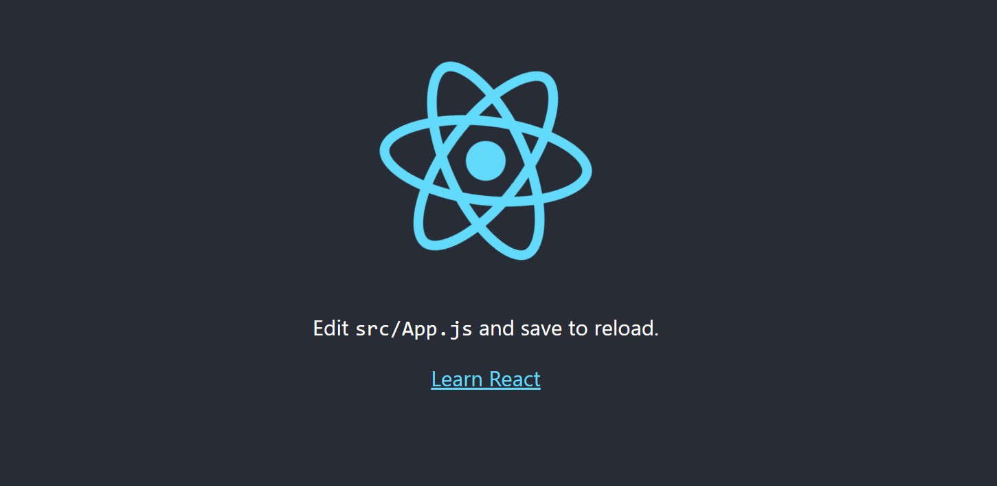
After installation, we should have this.
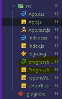
First We delete the all code inside App.js, App.css it looks like this
App.js
import "./App.css";

function App() {
  return <div className="App"></div>;
}

export default App;
App.css
/*in this file there is no code till now*/
This page is showing empty because we didn't write anything in side App.js we create two files Progressbar.js progressbar.css In Progressbar.js we will write all code for creating a Progressbar and inprogressbar.css we will write all the CSS things for the form so let's start.

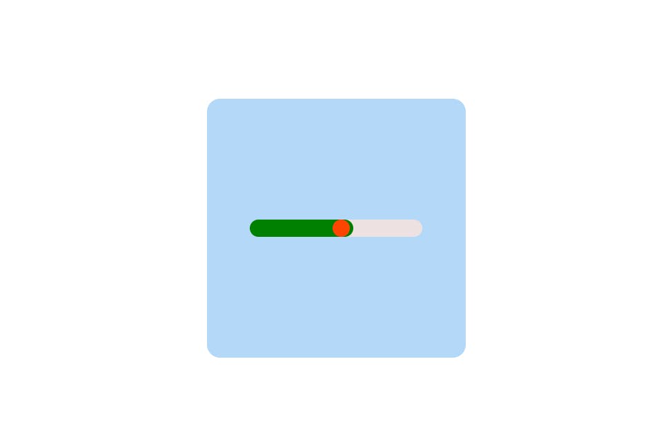
Alright, let me break this problem down for you. In your Progressbar.js file, you need to create a div for the sky blue background, and three separate divs for the progress bar, indicator, and red circle, respectively. Then, you need to import the Progressbar.js and progressbar.css files into your App.js file. Does that make sense?
Progressbar.js
import React from "react";
import "./progressbar.css";
const Progressbar = () => {
  const value = 60;

  return (
    // outer contaner for skyblue
    <div className="container">
      {/* inside container for grey */}
      <div className="progress-container">
        {/* inside container for green */}
        <div className="indicator" style={{ width: `${value}%` }}></div>
        {/* inside container for red */}
        <div className="inicatorcircle"></div>
      </div>
    </div>
  );
};

export default Progressbar;
progressbar.css
.container {
  display: flex;
  align-items: center;
  justify-content: center;
  width: 300px;
  height: 300px;
  cursor: pointer;
  background-color: rgb(180, 216, 247);
  border-radius: 15px;
}

.progress-container {
    /* height will be fixed in all the container */

  height: 20px;
  width: 200px;
  background-color: rgb(237, 225, 225);
  position: relative;
  border-radius: 15px;
}
.indicator {
    /* height will be fixed in all the container */

  height: 20px;
  background-color: green;
  width: 50%;
  animation: inidicator 1s;
  transition: 1s ease-in-out;
  border-radius: 15px;
}

.inicatorcircle {
    /* height will be fixed in all the container */

  width: 20px;
  height: 20px;
  border-radius: 50%;
  background-color: orangered;
  position: absolute;
  left: 48%;
  top: 0%;
  animation: inidicatorcircle 1s;
  transition: 1s ease-in-out;
}

@keyframes inidicatorcircle {
  from {
    left: 0%;
  }
  to {
    left: 48%;
  }
}
@keyframes inidicator {
  from {
    width: 0%;
  }
  to {
    width: 50%;
  }
}
App.js
import "./App.css";
import Progressbar from "./Progressbar";

function App() {
  return (
    <div className="App">
      <Progressbar />
    </div>
  );
}

export default App;
App.css
.App {
  background-color: white;
  display: flex;
  align-items: center;
  justify-content: center;
  width: 100vw;
  height: 100vh;
}
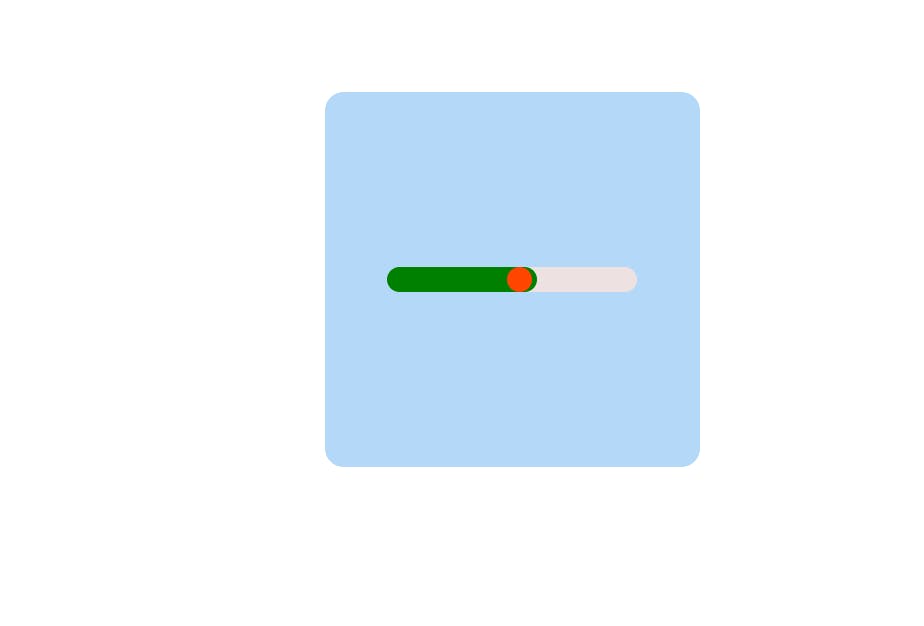
Let's see if the output will get the same or not:-

Using styled components, you can achieve the same result. let's start
💡Installation
Installing styled-components only takes a single command and you're ready to roll:
# with npmnpm install --save styled-components
# with yarnyarn add styled-components
f you use a package manager like yarn that supports the "resolutions" package.json field, we also highly recommend you add an entry to it as well corresponding to the major version range. This helps avoid an entire class of problems that arise from multiple versions of styled-components being installed in your project.
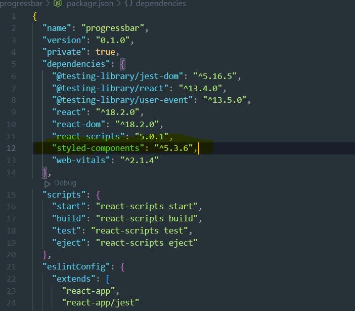
In package.json:
Getting Started
styled-components utilizes tagged template literals to style your components.
It removes the mapping between components and styles. This means that when you're defining your styles, you're creating a normal React component, that has your styles attached to it.
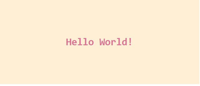
This example creates two simple components, a wrapper and a title, with some styles attached to them:
// Create a Title component that'll render an <h1> tag with some styles
const Title = styled.h1`
  font-size: 1.5em;
  text-align: center;
  color: palevioletred;
`;

// Create a Wrapper component that'll render a <section> tag with some styles
const Wrapper = styled.section`
  padding: 4em;
  background: papayawhip;
`;

// Use Title and Wrapper like any other React component – except they're styled!
render(
  <Wrapper>
    <Title>
      Hello World!
    </Title>
  </Wrapper>
);
Using styled-components, you can write the code for the progressbar.js file above the function components.
progressbar.js
import React from "react";
import styled from "styled-components";
// import "./progressbar.css";
// here you start styled-components
// Here we create a component that will rotate everything we pass in over two seconds
const ProgressbarContainerOuter = styled.div`
display: flex;
align-items: center;
justify-content: center;
width: 300px;
height: 300px;
cursor: pointer;
background-color: rgb(180, 216, 247);
border-radius: 15px;
`;
const ProgressbarContainer = styled.div`
height: 20px;
width: 200px;
background-color: rgb(237, 225, 225);
position: relative;
border-radius: 15px;
`;
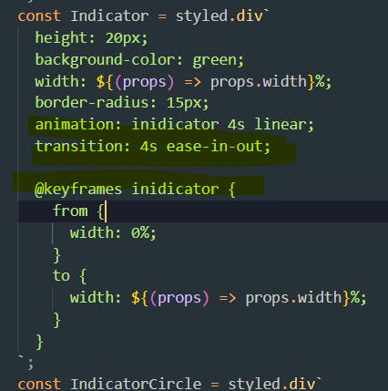
const Indicator = styled.div`
height: 20px;
background-color: green;
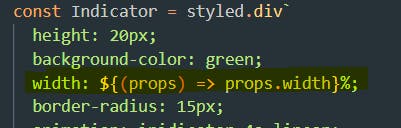
width: ${(props) => props.width}%;
border-radius: 15px;
animation: inidicator 4s linear;
transition: 4s ease-in-out;
@keyframes inidicator {
from {
width: 0%;
}
to {
width: ${(props) => props.width}%;
}
}
`;
const IndicatorCircle = styled.div`
width: 20px;
height: 20px;
border-radius: 50%;
background-color: orangered;
position: absolute;
left: ${(props) => props.position}%;
top: 0%;
animation: inidicatorcircle 4s;
transition: 1s ease-in-out;
@keyframes inidicatorcircle {
from {
left: 0%;
}
to {
left: ${(props) => props.position}%;
}
}
`;
//end here
//outside of function components
const Progressbar = ({ indicatorColor, indicatorBorderColor }) => {
const value = 60;
return (
// outer contaner for skyblue
<ProgressbarContainerOuter>
{/* inside container for grey */}
<ProgressbarContainer>
{/* inside container for green */}
<Indicator width={value} />
{/* inside container for red */}
<IndicatorCircle position={value - 2} />
</ProgressbarContainer>
</ProgressbarContainerOuter>
);
};
export default Progressbar;
App.js
import Progressbar from "./Progressbar";
import styled from "styled-components";
const AppContainer = styled.div`
background-color: white;
display: flex;
align-items: center;
justify-content: center;
width: 100vw;
height: 100vh;
`;
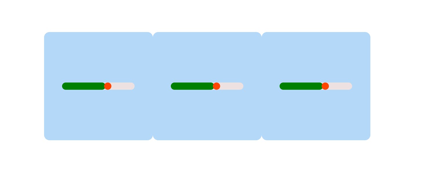
function App() {
return (
<AppContainer>
<Progressbar />
<Progressbar />
<Progressbar />
</AppContainer>
);
}
export default App;
Animations🎇
CSS animations with @keyframes aren't scoped to a single component but you still don't want them to be global to avoid name collisions. This is why we export a keyframes helper which will generate a unique instance that you can use throughout your app in the above code if you check what I used.
Passed props🧨
If the style target is a simple element (e.g. styled. div), styled-components passes through any known HTML attribute to the DOM. If it is a custom React component (e.g. styled(MyComponent)), styled components pass through all props.
This example shows how all props of the Input component are passed on to the DOM node that is mounted, as with React elements.
If you create your dynamic progress bar, you can use it throughout your application and style it as you like. That's the benefit of using a dynamic progress bar.
Output:-
if you want the completed code I'm sharing it with you my GitHub repo here is the link:-

🎯 Wrap Up!!
That's all for this article. Thank you for your time!! Let's connect to learn and grow together. If you enjoyed reading this post and have found it useful for you, then please give a clap, share it with your friends, and follow me to get updates on my upcoming posts. You can connect with me on LinkedIn.