


⛳Introduction

Tabs are a common user interface component used for navigation between different sections of a webpage or application.In this blog post, we'll create a simple tabbed navigation component using React.
Step 1: Setting Up the Project
First, let's set up a basic React project. We'll need to install React and create-react-app if we haven't already:

/* i had given diffrent folder name it's up to u whatever
you want u can give folder name */

npx create-react-app tabbed-navigation
cd tabbed-navigation
Next, we'll create a few files to organize our code:
App.js: This will be the main component of our application.TabsContainer.js: This component will render the tabbed navigation.Tab.js: This component will represent each individual tab.App.css,tab.css: This file will contain styles for our tabs.
I will share folder structure image for review below. I hope you have knowledge of React.js because I won't be covering the basics in this blog. If you have any questions, you can refer to my previous blog where I explained React basics. I will provide the GitHub link at the end of the blog so you can clone the repository or check out the code. Please focus on learning.

Step 2: Implementing the Tab Components

In Tab.js, we'll create a simple functional component to represent each tab. This component will accept props such as active, onClick, icon, className, and iconColor. Here's how it looks:-
import React from "react";
import "./tab.css";

const Tab = ({ active, onClick, icon, className, iconColor = "blue" }) => {
  return (
    <div
      className={`tab ${active ? "active-tab" : ""} ${className}`}
      onClick={onClick}
    >
      {React.cloneElement(icon, {
        style: { color: active ? "white" : iconColor },
      })}
    </div>
  );
};

export default Tab;
This component renders a <div> element with a tab class. It applies the active-tab class if the tab is active. We use React.cloneElement to customize the icon color based on the iconColor prop.
Step 3: Creating the Tabs Container
In TabsContainer.js, we'll create a component to render the tabbed navigation. This component will render multiple Tab components based on the provided props. Here's how it looks:

// TabsContainer.js
import React from "react";
import Tab from "./Tab";
import { RxDashboard } from "react-icons/rx";
import { RiArchiveDrawerFill } from "react-icons/ri";

function TabsContainer({
  activeTab,
  handleTabClick,
  tab1ClassName,
  tab2ClassName,
  tab1IconColor,
  tab2IconColor,
}) {
  return (
    <div className="tab-container">
      <Tab
        active={activeTab === "tab1"}
        onClick={handleTabClick("tab1")}
        icon={<RxDashboard />}
        iconColor={tab1IconColor}
        className={tab1ClassName}
      />
      <Tab
        active={activeTab === "tab2"}
        onClick={handleTabClick("tab2")}
        icon={<RiArchiveDrawerFill />}
        iconColor={tab2IconColor}
        className={tab2ClassName}
      />
    </div>
  );
}

export default TabsContainer;
This component renders a <div> element with a tab-container class. It includes two Tab components representing each tab in our navigation.
Step 4: Integrating with the App
In App.js, we'll integrate the TabsContainer component into our main application. We'll manage the active tab state and handle tab clicks in this component. Here's how it looks:

import { useState } from "react";
import "./App.css";
import TabsContainer from "./components/TabsContainer";
function App() {
  const [activeTab, setActiveTab] = useState("tab1");

  const openTab = (tabId) => {
    setActiveTab(tabId);
  };

  const handleTabClick = (tabId) => () => {
    openTab(tabId);
  };
  return (
    <>
      <div className="App">
        <div className="conatiner">
          <TabsContainer
            activeTab={activeTab}
            handleTabClick={handleTabClick}
            tab1ClassName="custom-tab-1"
            tab2ClassName="custom-tab-2"
            tab1IconColor="blue"
            tab2IconColor="blue"
          />

          <div
            className={
              activeTab === "tab1" ? "tab_one_container" : "tab_two_container"
            }
          >
            <h2>Content for {activeTab === "tab1" ? "Tab 1" : "Tab 2"}</h2>
            <p>
              This is the content for {activeTab === "tab1" ? "Tab 1" : "Tab 2"}
              .
            </p>
          </div>
        </div>
      </div>
    </>
  );
}

export default App;
This component manages the active tab state using the useState hook. It passes the necessary props to the TabsContainer component, including the active tab state, click handler function, custom classNames, and icon colors.
Step 5: Styling the App and Tabs
Finally, we'll add some CSS styles to tab.css and App.cssto customize the appearance of our tabs. Here's a basic example:

App.css
.App {
  background-color: #282c34;
  width: 100%;
  height: 100vh;
  display: flex;
  align-items: center;
  justify-content: center;
}
.conatiner {
  width: 500px;
  height: 500px;
  background-color: #e2e3e5;
  display: flex;
  flex-direction: column;
  align-items: center;
  justify-content: center;
  border-radius: 4px;
}

.tab-container {
  display: flex;
  justify-content: center;
  padding: 10px;
}

.tab_one_conatiner,
.tab_two_conatiner {
  display: flex;
  flex-direction: column;
  align-items: center;
  justify-content: center;
  border-radius: 4px;
  line-height: 1;
  width: 100%;
}
tab.css
.tab {
  background-color: white; /* Inactive background color */
  padding: 10px 40px;
  cursor: pointer;
  border: 1px solid blue;
}

.active-tab {
  background-color: blue; /* Active background color */
}

/* .custom-tab-1 {
  background-color: red;
  border: none;
}

.custom-tab-2 {
  background-color: green;
  border: none;
} */
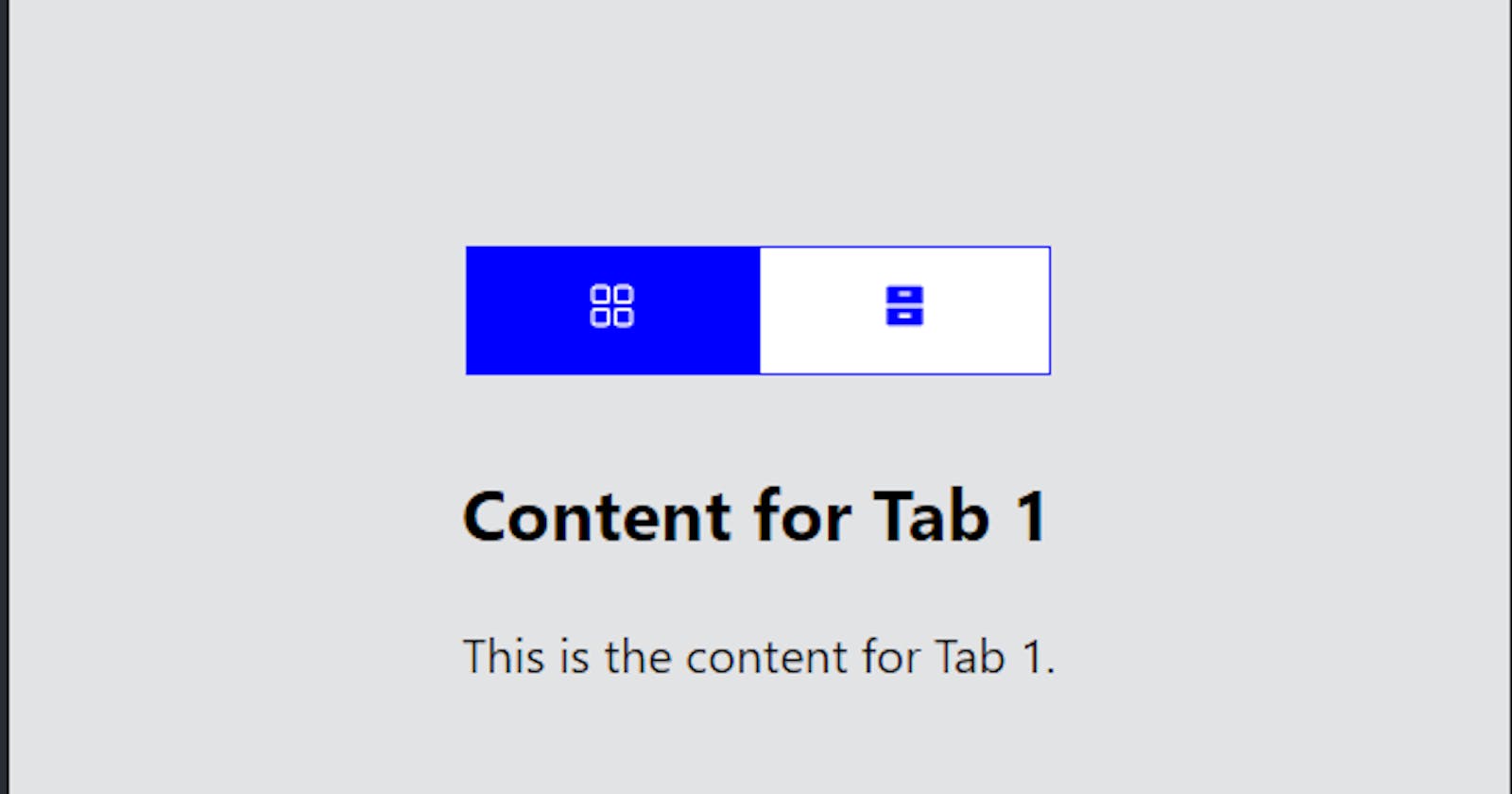
With these steps, we've created a simple tabbed navigation component in React. Users can easily navigate between different sections of the application by clicking on the tabs, and the active tab is highlighted accordingly.
🎯 Wrap Up!!

I hope you've learned how to create tabs from this blog. Here is the GitHub link: https://github.com/Richa-12y/tabs. You can clone the code or review it there. If you enjoyed my blog, please stay in touch with me, like, and share it. Happy coding👨💻! See you next week.