A beginners guide

Hi, I’m Richa — a Senior Frontend Engineer with 5+ years of experience building scalable, production-grade web interfaces for enterprise and consumer applications. I work primarily with React, TypeScript, and modern frontend architectures, focusing on component systems, performance, and maintainability. Most of my experience comes from building real-world products in regulated domains like banking and insurance, where clarity, reliability, and long-term ownership matter more than quick demos. Through this blog, I write about frontend engineering fundamentals, scalable UI design, problem-solving, and the lessons I’ve learned working on large codebases. My goal is to share practical insights — not shortcuts — for developers who want to grow strong engineering foundations. I also mentor early-career developers and strongly believe that curiosity, asking the right questions, and understanding why something works are more important than memorizing tools. If you’re serious about improving as an engineer, you’re in the right place.
Introduction Tailwind CSS
In this article, I will help you understand how to think in Tailwind CSS. We’ll go through a small theory 👩💻 intro and will jump next to a more hands-on 👋 exercise to practice what we learned.
What is Tailwind CSS 🧐?
TailwindCSS is a framework like no other. Rather than constraining you to a set design, it gives you the tools and the standardization to build exactly what you want.
Why Tailwind CSS 🥱?
1. Control Over Styling
Tailwind is a unique CSS framework when it comes to styling web applications, meaning that Tailwind does not have a default theme that you have to use like other CSS frameworks. For example, you can give each project a different look even if you use the same elements (color palette, size, etc.). Therefore, it’s one of the few CSS frameworks that is not opinionated on how you should style your project.
2. Faster CSS Styling Process
There is no faster framework than Tailwind when it comes to styling HTML. As a result, you can easily create good-looking layouts by styling elements directly. This is possible because Tailwind offers thousands of built-in classes that do not require you to create designs from scratch.
3. Responsiveness and Security
With Tailwind’s pre-built classes, you can design the layout directly in an HTML file. This makes it a very responsive, mobile-friendly CSS framework. Apart from that, Tailwind has proven to be a stable framework since its initial release.
4. Additional Features
Tailwind CSS works in the front end of a website. For this reason, it is reasonable for developers to demand ultimate responsiveness. Well, Tailwind provides the ability to create responsive themes for your web applications and remove all unused CSS classes. With PurgeCSS, Tailwind helps you keep your final CSS as small as possible.
👉TAILWIND CSS: ADVANTAGES
No more silly names for CSS classes and Id’s.
Minimum lines of Code in CSS file.
We can customize the designs to make the components.
Makes the website responsive.
Makes the changes in the desired manner.
CSS is global in nature and if make changes in the file the property is changed in all the HTML files linked to it. But with the help of Tailwind CSS we can use utility classes and make local changes.
👉TAILWIND CSS: DISADVANTAGES
1. Styling and HTML are Mixed
Because you do not have to write CSS rules yourself, Tailwind works differently than most CSS frameworks. While this is great for those unfamiliar with CSS, it also means that Tailwind mixes style rules in with your HTML files.
2. It Takes Time to Learn
Because of the built-in classes, Tailwind CSS is quite learning-intensive. Even for experienced developers, it can be a challenge to learn how to use and fully utilize the pre-built classes. But, of course, as with any other development task, practice makes perfect.
3. Lack of Important Components
Unlike Bulma and Bootstrap, Tailwind does not have many significant styling components. Unfortunately, this means you have to manually add features like headers, buttons, and navigation bars for web apps.
Some comments before we start
TailwindCSS doesn’t have JavaScript included, it is pure CSS.
I will assume you know the basics of CSS 😄.
We won’t go through the installation of TailwindCSS, for that feel free to check theirinstallation guide.
👉 Add Tailwind using Play CDN
1. Add the play CDN script tag to the head of your HTML file.
<script src="https://cdn.tailwindcss.com"></script>
2.TailwindCSS configuration lives in a file called tailwind.config.js. In this file, we can customize every TailwindCSS variable.
<script>
      tailwind.config = {
        theme: {
          screens: {
            sm: "480px",
            md: "768px",
            lg: "976px",
            xl: "1440px",
          },
          extend: {
            colors: {
              myblue: "#00baf2",
              myred: "#EB4D4B",
              backgroundcolor: "#0f4a8a",
            },
          },
        },
      };
    </script>
3. Add some custom CSS Use type="text/tailwindcss" to add custom CSS that supports all of Tailwind's CSS features.
<style type="text/tailwindcss">
  @layer utilities {
    .content-auto {
      content-visibility: auto;
    }
  }
</style>
<body>
<div class="lg:content-auto">
  <!-- ... -->
</div>
</body>
4.Enable first-party plugins, like forms and typography, using the plugins query parameter.
<!doctype html>
<html>
<head>
<meta charset="UTF-8">
<meta name="viewport" content="width=device-width, initial-scale=1.0">
<script src="https://cdn.tailwindcss.com?plugins=forms,typography,aspect-ratio,line-clamp"></script>
</head>
<body>
<div class="prose">
 <!-- ... -->
</div>
</body>
</html>
How TailwindCSS works
Utility Classes: As with most frameworks, TailwindCSS uses utility classes to style
HTMLelements; its naming convention is super intuitive (text-center, font-bold, etc.).Prefixes: We can add prefixes on different classes to make them work conditionally on different breakpoints or states.
For example:
hover:font-boldwill change the font of the element to bold when hovered.
Prefixes Responsive Design see docs
*Every utility class in Tailwind can be applied conditionally at different breakpoints, which makes it a piece of cake to build complex responsive interfaces without ever leaving your HTML. *
Usage
<div class="md:w-92 lg:w-40">
 [...]
<div class="sm:text-center lg:text-left">
Hover, Focus & other states
As with the responsive design, we can use prefixes to style different states of our elements.
Usage
<button class="bg-sky-500 hover:bg-sky-700 ">
  Save changes
</button>
Utility Classes
TailwindCSS utility classes keeps the same structure among most CSS properties. We’ll go through some examples to clarify how the structure works, but feel free to find any specific utility class on their amazing documentation.
Fonts
Font Family → font-family → font-{type}
<p class="font-sans ...">The quick brown fox ...</p>
<p class="font-serif ...">The quick brown fox ...</p>
<p class="font-mono ...">The quick brown fox ...</p>
Note: font-sans, font-serif and font-mono are variables that we can change in our config file to the font-family of our choice.
Font Size → font-size → text-{size}
<p class="text-sm ...">The quick brown fox ...</p>
<p class="text-base ...">The quick brown fox ...</p>
<p class="text-lg ...">The quick brown fox ...</p>
<p class="text-xl ...">The quick brown fox ...</p>
<p class="text-2xl ...">The quick brown fox ...</p>
Font Weight→ font-weight → font-{weight}
<p class="font-light ...">The quick brown fox ...</p>
<p class="font-normal ...">The quick brown fox ...</p>
<p class="font-medium ...">The quick brown fox ...</p>
<p class="font-semibold ...">The quick brown fox ...</p>
<p class="font-bold ...">The quick brown fox ...</p>
Text Align→ text-align → text-{alignment}
<p class="text-left">So I started to walk into the water</p>
<p class="text-center">So I started to walk into the water</p>
<p class="text-right">So I started to walk into the water</p>
Container
The container class will fix the element width depending on the current breakpoint.
Container→ width
<div class="container mx-auto">
  <!-- ... -->
</div>
Margin & Padding
Margin → margin → m{direction}-{size}
<div class="mt-8 ...">mt-8</div>
<div class="m-5 ...">m-5</div>
Left + Right → mx
Top + Down → my
Padding→ padding → p{direction}-{size}
<div class="pt-6 ">pt-6</div>
<div class="pr-4 ">pr-4</div>
<div class="pb-8">pb-8</div>
<div class="pl-2">pl-2</div>
Left + Right ⇒ px
Top + Down ⇒ py
Colors
The color class utilities allow us to use the same kind of syntax to style different properties.
{property}-{color}-{value}
<p class="text-purple-600 ..."></p>
<button class="bg-green-500 ...">Button</button>
<input class="border-2 border-red-500 ...">
Width and Height
Height→ height → h{direction}-{size}
<div class="h-48">
  <div class="h-full ...">
    <!-- This element will have a height of `12rem` (h-48) -->
  </div>
</div>
Width→ width → w{direction}-{size}
<div class="w-96 ..."></div>
<div class="w-80 ..."></div>
<div class="w-64 ..."></div>
<div class="w-48 ..."></div>
<div class="w-40 ..."></div>
<div class="w-32 ..."></div>
<div class="w-24 ..."></div>
Display
No rocket science here, just classes that apply different display properties.
flex→display: flexinline-block→display: inline-blockhidden→display: none
Enough theory! Let’s create some Example

🥱Bye Bye theory
Main Header
<!DOCTYPE html>
<html>
<head>
<meta charset="utf-8">
<meta name="viewport" content="width=device-width">
<title>JS Bin</title>
<script src="https://cdn.tailwindcss.com"></script>
</head>
<body>
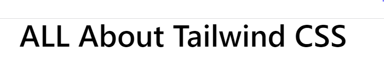
<h1 class="text-5xl font-semibold text-center">ALL About Tailwind CSS</h1>
</body>
</html>
What utilities did we use?
text-5xl →
font-sizeandline-heightfont-semibold →
font-weighttext-center →
text-align
Container
*Now let’s add a simple container so we can center our components later. *
<!DOCTYPE html>
<html>
<head>
<meta charset="utf-8">
<meta name="viewport" content="width=device-width">
<title>JS Bin</title>
<script src="https://cdn.tailwindcss.com"></script>
</head>
<body>
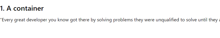
<div class="container m-auto">
<h2 class="text-2xl font-semibold my-3">1. A container</h2>
<p>“Every great developer you know got there by solving problems they were unqualified to solve until they actually did it.”
</p>
</div>
</body>
</html>
What new utilities did we use?
container →
max-widthon breakpoint (sm,md,lg,xl,2xl)mx-auto →
margin-leftandmargin-rightmy-3 →
margin-topandmargin-bottom
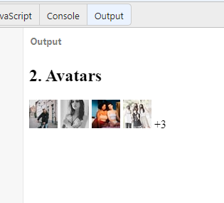
Avatars
Let’s now play with some image properties by creating avatars.
<!DOCTYPE html>
<html>
<head>
  <meta charset="utf-8">
  <meta name="viewport" content="width=device-width">
  <title>JS Bin</title>
  <script src="https://cdn.tailwindcss.com"></script>

</head>
<body>
<h2 class="text-2xl font-semibold my-3">2. Avatars</h2>
  <div class="flex flex-col items-center justify-center">
    <div class="flex -space-x-4">
        <img alt="" class="w-12 h-12 border rounded-full dark:bg-gray-500 dark:border-gray-700" src="https://source.unsplash.com/40x40/?portrait?1">
        <img alt="" class="w-12 h-12 border rounded-full dark:bg-gray-500 dark:border-gray-700" src="https://source.unsplash.com/40x40/?portrait?2">
        <img alt="" class="w-12 h-12 border rounded-full dark:bg-gray-500 dark:border-gray-700" src="https://source.unsplash.com/40x40/?portrait?3">
        <img alt="" class="w-12 h-12 border rounded-full dark:bg-gray-500 dark:border-gray-700" src="https://source.unsplash.com/40x40/?portrait?4">
        <span class="flex items-center justify-center w-12 h-12 font-semibold border rounded-full dark:bg-gray-900 dark:text-gray-100 dark:border-gray-700">+3</span>
    </div>
</div>
</body>
</html>
What new utilities did we use?
rounded-full →
border-radiush-12 & w-12 →
weightandheightdisplay→
flex flex-colitems-centerjustify-center
👉 Responsive Design
smminimum width 640px CSS @media (min-width: 640px) { ... }
mdminimum width 768px CSS @media (min-width: 768px) { ... }
lgminimum width 1024px CSS @media (min-width: 1024px) { ... }
xlminimum width 1280px CSS @media (min-width: 1280px) { ... }
2xlminimum width 1536px CSS @media (min-width: 1536px) { ... }

👉 Mobile First
By default, Tailwind uses a mobile-first breakpoint system, similar to what you might be used to in other frameworks like Bootstrap.
<!-- This will center the text on mobile, and left align it on screens 640px and wider -->
<div class="text-center sm:text-left"></div>
👉 Targeting a single breakpoint
<div class="bg-green-500 md:bg-red-500 lg:bg-green-500">
  <!-- ... -->
</div>
👉 Customizing breakpoints
You can completely customize your breakpoints in your tailwind.config.js file:
module.exports = {
   theme: {
     screens: {
       'tablet': '640px',
       // => @media (min-width: 640px) { ... }
       'laptop': '1024px',
       // => @media (min-width: 1024px) { ... }
       'desktop': '1280px',
       // => @media (min-width: 1280px) { ... }
     },
    }
  }
👉 Resources
Check out some of these resources for a more in-depth:- TailwindCss geeksforgeeks
In closing
I hope that you've found this Blog helpful..! If you have any question or feedback, feel free to leave a comment below.